Composition is defined as the arrangement of the elements and principles of design.
How do we make paintings, sculptures, websites, clothing, posters, movies, photographs visually attractive? How do we immediately know that the pants we picked out don’t match the shirt we want to wear? How do we know that one car has a better design than the next car. Those ideas, what could be called aesthetics, are all dealing with composition.
As art students we need to understand what creates good, well organized compositions and the problems we can run into with bad or disorganized compositions. Although introductory courses such as 2D Design and Drawing 1 will stress that you understand and use good design, there are many artists that, once they understand the rules of design, choose to break them. Like with most things in life, we have to understand the rules before we can start to break them.
Well designed compositions can be achieved by understanding how the Elements and Principles of Design work together. The Elements can be described as the parts in a car; the muffler, gas tank, brake pedal, windshield wipers, etc. The Principles are how those parts work together.
As you work, ask yourself –
How does the work of art create __________________ (insert principle) through the use of ___________________ (insert element) ?
For example: How does the work of art create repetition through line? How does the work of art create balance through color? How does the work of art create contrast through value? How does the work of art create movement through space? You could run through one principle with all 7 elements.
How does the work of art create contrast through line?
How does the work of art create contrast through shape?
How does the work of art create contrast through form?
How does the work of art create contrast through value?
How does the work of art create contrast through texture?
How does the work of art create contrast through space?
How does the work of art create contrast through color?
Asking these questions will help you have a better understanding of what is working in your composition and what needs to be adjusted. The principles of design help you to carefully plan and organize the elements of art so that you will hold interest and command attention. Interesting works of art hold the viewer’s attention, visually and/or conceptually.
In any work of art there is a thought process for the arrangement and use of the elements of design. The artist who has an understanding of the principles of good composition will typically create a more interesting work of art . The center of interest will be strong and the viewers will not look away, instead, they will be drawn into the work. A good knowledge of composition is essential to producing good artwork. Some artists today like to bend or ignore these rules and therefore are experimenting with different forms of expression. Composition is hugely important, but like any rule in art, they can be broken.
Line – can be considered in two ways. The linear marks made with a pen or brush or the edge created when two shapes meet. We can all draw a line, but defining it with words becomes more difficult. At its simplest, a line is a mark on a surface that describes a shape or outline. It can create texture and can be thick and thin. Types of line can include actual, implied, vertical, horizontal, diagonal and contour lines.
Shape – is a 2-dimensional line with no form or thickness. Shapes are flat and can be grouped into two categories, geometric and organic.
Form – is a 3-dimensional object having volume and thickness. Form can be real, as in a sculpture or implied, as in a drawing. To imply form you might use light and shading techniques to make a circle look like a sphere. Forms can be viewed from many different angles.
Value – is the degree of light and dark in a design. It is the contrast between black and white and all the tones in between. Value can be used with color as well as black and white. Contrast is the extreme changes between values. Color and value are sometimes confused when starting to study the Elements of Design. Color refers to hue (red, yellow, blue…) while value refers to lightness or darkness only.
Texture – describes surface quality either actual or implied. Actual texture is how something feels when you touch it. A rock feels rough, a feather smooth etc. Implied texture is how an object appears to feel. A drawing of a rock appears/implies that the texture is rough but if we touch the sheet of paper it feels smooth. Texture is the degree of roughness or smoothness in objects and relies heavily on value and lighting. Want to take a really youthful photo of yourself? Point as many lights at your face as possible. The light will “fill” in any wrinkles, washing out the shadows cause by these wrinkles. Lighting your face from a really harsh angle will enhance the texture of your face, creating a photo that is probably not very flattering.
Space – the area in, around, above or below an object. Two types of space exist; positive and negative. Positive space is usually the object being drawn or the darker object while negative space is everything but the object and usually lighter. An easy way to determine which is positive is to ask yourself which are or object do you look at first. That is typically the positive space. Negative or empty space is just as important as positive space.
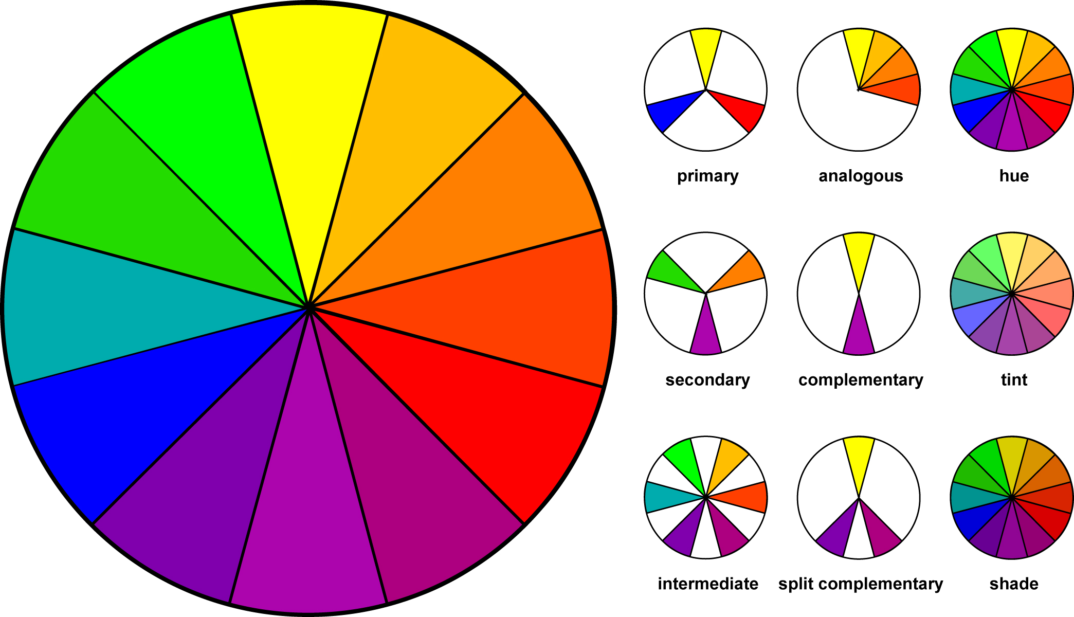
Color – is the reflected light that we are able to see with our eyes. It also refers to specific hues and has 3 properties, Hue, Chroma and Value. The color wheel is a way of showing the chromatic scale in a circle using all the colors made with the primary triad. Complimentary pairs can produce dull and neutral color. Black and white can be added to produce tints (add white), shades (add black) and tones (add gray).
Principles of Compositional Design
The principles of design are the recipe for a good work of art. The principles combine the elements to create an aesthetic placement of things that will produce a good design.
Emphasis/Focal Point – is an area that first attracts attention in a composition. This area is more important when compared to the other objects or elements in a composition. This can be by contrast of values, contrasting colors, placement in the artwork (we are naturally drawn to the center), a change from no pattern to pattern.
Balance – is a feeling of visual equality in shape, form, value, color, etc. Balance can be symmetrical or evenly balanced or asymmetrical and un-evenly balanced. Objects, values, colors, textures, shapes, forms, etc., can be used in creating a balance in a composition. A third but seldom used form of balance is what is called radial balance. You can see this type of balance in hubcaps on a car and rose windows in churches.
Unity/Harmony – is the visually satisfying effect of combining similar, related elements. eg. adjacent colors on the color wheel, similar shapes etc. Unity is the relationship among the elements of a work of art that helps all of the elements function together. Unity gives a sense of oneness to a visual image.
Contrast – creates a visual discord in a composition. Contrast is the juxtaposition of opposing elements eg. opposite colors on the color wheel – red / green, blue / orange etc. Contrast in tone or value – light / dark. Contrast in direction – horizontal / vertical. The major contrast in a work of art should be located at the center of interest, your focal point. Too much contrast scattered throughout a painting can destroy unity and make a work difficult to look at. Unless a feeling of chaos and confusion are what you are seeking, it is a good idea to carefully consider where to place your areas of maximum contrast.
Movement – is a visual flow through the composition. It can be the suggestion of motion in a design as you move from object to another object by they are placed or their position in relationship to another object. Directional movement can be created through implied lines (dotted lines), a change in value (moving from light to dark), a change in color (red to red orange to orange), a change in scale (small to large). There can be implied movement (a light source in a painting that helps guide our eyes through the composition) or actual/physical movement (a sculpture that actually moves).
Pattern/Rhythm – is the use of similar elements again and again. If you repeat a line or shape over and over, you are visually creating a beat, a sense of timing for the viewer. Think plaid shorts or striped shirt. Sometimes this can become monotonous. The monotony can be broken while still maintaining a sense of pattern by keeps one element through similar but adjusting another element. If you have 50 square that were all the same size but painted each one a different color, you still create a pattern but a much more engaging pattern. Pattern can be combined with movement.
Variety – provides contrast to harmony and unity. If you have a grid of 1,000 black and white squares you have unity through shape. If you paint one of those squares red, you’ve just introduced variety. Most viewers will look directly at the red square first simply because it’s different. Art needs a combination of unity and variety. Too much unity and it can become boring. Too much variety and it becomes chaotic.
Proportion/Scale – Proportion is the size relationship of parts to a whole and to one another. Babies are cute because their heads and eyes are so large when compared to the rest of their body. Their head and eyes are not in proportion to the rest of their body. Whenever you start a drawing, you can check proportions by comparing one object to another and asking if it’s too big, too small, too flat, too round… Scale refers to relating size to a constant, such as a human body. If you look on the box of a model car kit, you’ll see numbers such as 1:24th scale. This means that the car in the box with be 1/24 the size of a real car. Some artworks work better on a small scale (creates intimacy) while others on a much larger scale (commands attention).
The videos linked below are good visual guides for understanding the principles defined above but not everyone agrees on the list of principles. For this class we will use the ones outlined above but keep in mind that they are flexible.
Color is complicated. To better understand how to use it in your work there are additional resources and videos below.
Color in design is very subjective. What evokes one reaction in one person may evoke a very different reaction in someone else. Sometimes this is due to personal preference, and other times due to cultural background. Color theory is a science in itself. Color is also the most difficult but also the most powerful of the 7 elements of design. It can make someone feel sad or happy. It can make you want to eat more or not at all. It can imply life or death. It can encourage learning and also do just the opposite. Color is complicated. One tiny shift from blue-green to a slightly greener blue-green can change how you interpret or how you feel about a work of art. There are entire books written on the psychology of color and color theory. This section will introduce you to some of those thoughts as well as illustrate various ways to use color in your work. What follows focuses predominately on color that can be mixed using paint or colored pencils. Colored lights work very different when mixed.
Color can be broken down into Hue, Chroma (Saturation) and Value.
Hue – the color itself; red, blue yellow. We don’t talk about dark or light when referring to Hue, just the color.
Chroma / Saturation – Is the red a really strong red or is it more washed out than a real red? Saturation is the intensity of the color. A red straight from a tube of paint is very saturated but when you mix it with white or thin it with water, the saturation lessens.
Value – the lightness or darkness. A light yellow may appear more lemon while a dark yellow may appear more mustard.
Primary – The three most basic colors are Red, Yellow and Blue. These are known as Primary colors. There is nothing you can use to mix these colors, however you can use these three colors (and sometimes white) to mix almost every color in the world. If you are short on money, you only need to buy red, yellow, blue and white.
Secondary – Mixing any two Primaries creates a Secondary color. Secondaries include Orange, Green and Violet (Purple).
Tertiary – Mixing a Primary and a Secondary creates a Tertiary (sometimes called Intermediate). Tertiaries are named with their primary color first and secondary color last. If I mix Red and Violet, I get a Red-Violet. Although Violet-Red is technically the same color, we always name them with the Primary name first. Blue and Green = Blue-Green. Yellow and Orange = Yellow-Orange.
Warm Colors
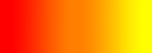
Warm colors include red, orange, and yellow, and variations of those three colors. These are the colors of fire, of fall leaves, and of sunsets and sunrises, and are generally energizing, passionate, and positive.
Red and yellow are both primary colors, with orange falling in the middle, which means warm colors are all truly warm and aren’t created by combining a warm color with a cool color. Use warm colors in your designs to reflect passion, happiness, enthusiasm, and energy.
Red (Primary Color)

Red is a very hot color. It’s associated with fire, violence, and warfare. It’s also associated with love and passion. In history, it’s been associated with both the Devil and Cupid. Red can actually have a physical effect on people, raising blood pressure and respiration rates. It’s been shown to enhance human metabolism, too.
Red can be associated with anger, but is also associated with importance (think of the red carpet at awards shows and celebrity events). Red also indicates danger (the reason stop lights and signs are red, and that most warning labels are red).
Outside the western world, red has different associations. For example, in China, red is the color of prosperity and happiness. It can also be used to attract good luck. In other eastern cultures, red is worn by brides on their wedding days. In South Africa, however, red is the color of mourning. Red is also associated with communism. Red has become the color associated with AIDS awareness in Africa due to the popularity of the [RED] campaign.
In design, red can be a powerful accent color. It can have an overwhelming effect if it’s used too much in designs, especially in its purest form. It’s a great color to use when power or passion want to be portrayed in the design. Red can be very versatile, though, with brighter versions being more energetic and darker shades being more powerful and elegant.
Orange (Secondary Color)

Orange is a very vibrant and energetic color. In its muted forms, it can be associated with the earth and with autumn. Because of its association with the changing seasons, orange can represent change and movement in general.
Because orange is associated with the fruit of the same name, it can be associated with health and vitality. In designs, orange commands attention without being as overpowering as red. It’s often considered more friendly and inviting, and less in-your-face.
Yellow (Primary Color)

Yellow is often considered the brightest and most energizing of the warm colors. It’s associated with happiness and sunshine. Yellow can also be associated with deceit and cowardice, though (calling someone yellow is calling them a coward).
Yellow is also associated with hope, as can be seen in some countries when yellow ribbons are displayed by families who have loved ones at war. Yellow is also associated with danger, though not as strongly as red.
In some countries, yellow has very different connotations. In Egypt, for example, yellow is for mourning. In Japan, it represents courage, and in India it’s a color for merchants.
In your designs, bright yellow can lend a sense of happiness and cheerfulness. Softer yellows are commonly used as a gender-neutral color for babies (rather than blue or pink) and young children. Light yellows also give a more calm feeling of happiness than bright yellows. Dark yellows and gold-hued yellows can sometimes look antique and be used in designs where a sense of permanence is desired.

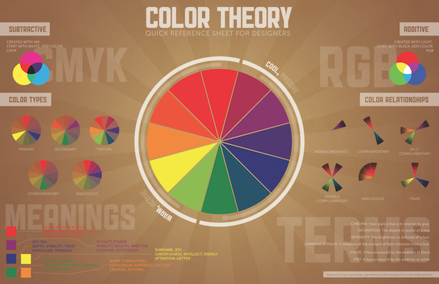
Cool colors include green, blue, and purple, are often more subdued than warm colors. They are the colors of night, of water, of nature, and are usually calming, relaxing, and somewhat reserved.
Blue is the only primary color within the cool spectrum, which means the other colors are created by combining blue with a warm color (yellow for green and red for purple). Greens take on some of the attributes of yellow, and purple takes on some of the attributes of red. Use cool colors in your designs to give a sense of calm or professionalism.
Green (Secondary Color)

Green is a very down-to-earth color. It can represent new beginnings and growth. It also signifies renewal and abundance. Alternatively, green can also represent envy or jealousy, and a lack of experience.
Green has many of the same calming attributes that blue has, but it also incorporates some of the energy of yellow. In design, green can have a balancing and harmonizing effect, and is very stable. It’s appropriate for designs related to wealth, stability, renewal, and nature. Brighter greens are more energizing and vibrant, while olive greens are more representative of the natural world. Dark greens are the most stable and representative of affluence.
Blue (Primary Color)

Blue is often associated with sadness in the English language. Blue is also used extensively to represent calmness and responsibility. Light blues can be refreshing and friendly. Dark blues are more strong and reliable. Blue is also associated with peace, and has spiritual and religious connotations in many cultures and traditions (for example, the Virgin Mary is generally depicted wearing blue robes).
The meaning of blue is widely affected depending on the exact shade and hue. In design, the exact shade of blue you select will have a huge impact on how your designs are perceived. Light blues are often relaxed and calming. Bright blues can be energizing and refreshing. Dark blues are excellent for corporate websites or designs where strength and reliability are important.
Violet – Purple (Secondary Color)

Purple was long associated with royalty. It’s a combination of red and blue, and takes on some attributes of both. It’s associated with creativity and imagination, too.
In Thailand, purple is the color of mourning for widows. Dark purples are traditionally associated with wealth and royalty, while lighter purples (like lavendar) are considered more romantic.
In design, dark purples can give a sense wealth and luxury. Light purples are softer and are associated with spring and romance.
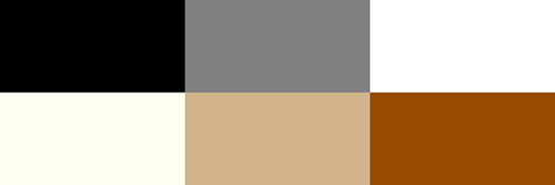
Neutral colors often serve as the backdrop in design. They’re commonly combined with brighter accent colors. But they can also be used on their own in designs, and can create very sophisticated layouts. The meanings and impressions of neutral colors are much more affected by the colors that surround them than are warm and cool colors.
Black

Black is the strongest of the neutral colors. On the positive side, it’s commonly associated with power, elegance, and formality. On the negative side, it can be associated with evil, death, and mystery. Black is the traditional color of mourning in many Western countries. It’s also associated with rebellion in some cultures, and is associated with Halloween and the occult.
Black is commonly used in edgier designs, as well as in very elegant designs. It can be either conservative or modern, traditional or unconventional, depending on the colors it’s combined with. In design, black is commonly used for typography and other functional parts, because of it’s neutrality. Black can make it easier to convey a sense of sophistication and mystery in a design.
White

White is at the opposite end of the spectrum from black, but like black, it can work well with just about any other color. White is often associated with purity, cleanliness, and virtue. In the West, white is commonly worn by brides on their wedding day. It’s also associated with the health care industry, especially with doctors, nurses and dentists. White is associated with goodness, and angels are often depicted in white.
In design, white is generally considered a neutral backdrop that lets other colors in a design have a larger voice. It can help to convey cleanliness and simplicity, though, and is popular in minimalist designs. White in designs can also portray either winter or summer, depending on the other design motifs and colors that surround it.
Gray
Gray is a neutral color, generally considered on the cool end of the color spectrum. It can sometimes be considered moody or depressing. Light grays can be used in place of white in some designs, and dark grays can be used in place of black.
Gray is generally conservative and formal, but can also be modern. It is sometimes considered a color of mourning. It’s commonly used in corporate designs, where formality and professionalism are key. It can be a very sophisticated color. Pure grays are shades of black, though other grays may have blue or brown hues mixed in. In design, gray backgrounds are very common, as is gray typography.
Brown

Brown is associated with the earth, wood, and stone. It’s a completely natural color and a warm neutral. Brown can be associated with dependability and reliability, with steadfastness, and with earthiness. It can also be considered dull.
In design, brown is commonly used as a background color. It’s also seen in wood textures and sometimes in stone textures. It helps bring a feeling of warmth and wholesomeness to designs. It’s sometimes used in its darkest forms as a replacement for black, either in backgrounds or typography.
Beige and Tan

Beige is somewhat unique in the color spectrum, as it can take on cool or warm tones depending on the colors surrounding it. It has the warmth of brown and the coolness of white, and, like brown, is sometimes seen as dull. It’s a conservative color in most instances, and is usually reserved for backgrounds. It can also symbolize piety.
Beige in design is generally used in backgrounds, and is commonly seen in backgrounds with a paper texture. It will take on the characteristics of colors around it, meaning it has little effect in itself on the final impression a design gives when used with other colors.
Cream and Ivory

Ivory and cream are sophisticated colors, with some of the warmth of brown and a lot of the coolness of white. They’re generally quiet, and can often evoke a sense of history. Ivory is a calm color, with some of the pureness associated with white, though it’s a bit warmer.
In design, ivory can lend a sense of elegance and calm to a site. When combined with earthy colors like peach or brown, it can take on an earthy quality. It can also be used to lighten darker colors, without the stark contrast of using white.
Above is the basic 12 spoke color wheel. 3 primaries, 3 secondaries and 6 tertiaries. There are millions of different colors but it is thought that our eye can distinguish about 2.4 million different colors and even more under different types of lighting. Listed below are some basic color theories that should help you create better looking works of art and to have a better understanding of why some colors work and why others do not.
The woman in the video below…is a little excited about color, but knowing that she was one of the lead graphic designers for Google and YouTube means she knows what she’s talking about. Just turn the volume down a little as you watch it.
Monochromatic
Monochromatic color schemes are made up of different tones, shades and tints within a specific hue. These are the simplest color schemes to create, as they’re all taken from the same hue, making it harder to create a jarring or ugly scheme (though both are still possible).


Analogous
Analogous color schemes are the next easiest to create. Analogous schemes are created by using three colors that are next to each other on the 12-spoke color wheel. Generally, analogous color schemes all have the same chroma/intensity level, but by using tones, shades and tints we can add interest to these schemes and adapt them to our needs for creating works of art.


Complementary
Complementary schemes are created by combining colors from opposite sides of the color wheel. In their most basic form, these schemes consist of only two colors, but can easily be expanded using tones, tints, and shades. A word of warning, though: using colors that are exact opposites with the same chroma and/or value right next to each other can be very jarring visually (they’ll appear to actually vibrate along their border in the most severe uses). This is best avoided (either by leaving white space between them or by adding another, transitional color between them).


Beige and brown are really tints and shades of orange
Split Complementary
Split complementary schemes are almost as easy as the complementary scheme. In this scheme, instead of using colors that are opposites, you use colors on either side of the hue opposite your base hue.


Triadic
Triadic schemes are made up of hues equally spaced around the 12-spoke color wheel. This is one of the more diverse color schemes.


Additional Research:
Composition and Design
Incredible Art Department
Sources:
Smashing Magazine
